Monday 28 February 2011

Graphical Evidence of Questionnaire Analysis

Displayed below are a number of graphs which have resulted from analysis of my questionnaire. There are 3 different sections concerned with the questionnaire; the front cover, the contents page and the double page spread.
These graphs represent the opinions of the general audience aged 16-19 within my area of how to create a music magazine that will meet its purpose with more success.
I handed out 20 questionnaires and received 20 questionnaires back so therefore the number of answers I receive back for each question should total up to 20.

The front cover 
The graph above is regarding the front cover. As you can see the title on the graph is a query I have raised, and the available answers are "Yes" and "No". The result from this graph is the majority of people chose "Yes", however it is a narrow result, as it is a difference of 2 votes, and therefore it is not a completely clear set of answers.

The graph above is to do with the "appropriate amount of cover lines on the front cover". The answers available have a wide range which is; "1,2,3,4,5,6 and 7+". Giving this sort of wide range helps me to seek more precise results from this graph as I can find out the exact specific features that the audience want on this magazine. There is a clear answer available from this graph, and the clear majority chose "4" as the optimum amount of cover lines on the front cover of the magazine.

The graph above is concerning the "Main image on the front cover". There are 5 answers available and there are 3 answers that the majority have picked the most and they are approximately the same level. The "Solo Female Artist" has got the most votes, but very narrowly to the "Solo Male Artist" and the "Male Group" options.

The graph above is regarding the "Writing Colour beneath the cover lines" on the front cover. The available answers for the audience are "Yes" and "No". The result was clear as 17 of the 20 questionnaires received said "Yes". This therefore gives me a clear indication to use a different colour for the writing underneath my cover lines. 

The graph above is regarding the "Title Font" and which style I should use for it. The available answers are; Seriff, San Seriff, Seriff + Bold and San Seriff + Bold. From a visual analysis of the graph, the font "San Seriff" seems to be the font being chosen most. The choice between using a bold font or not seems to be my decision as the audience answers are too close to clearly indicate a preference.

The graph above provides analysis of audience opinions on whether or not the title should overlap the main image on the front cover. The majority decision from the audience is yes, with 14 out of 20 people saying yes and therefore it is a clear indication.

The graph above is asking the audience what colour scheme they think will be best on a magazine. The majority vote by 3 votes to the nearest answer, with a total of 8 votes was Black, Red and White. Therefore, I will consider this type of colour scheme for my magazine

In the graph above, I have asked the audience what font they think would be best to use for cover lines, and the majority decision was Seriff + Bold which was 3 votes clear of the next closest answer.

The graph above provides analysis of the results regarding how many images should be used on the front cover. The majority decision with 14 out of 20 votes is to use 1 image on the front cover.

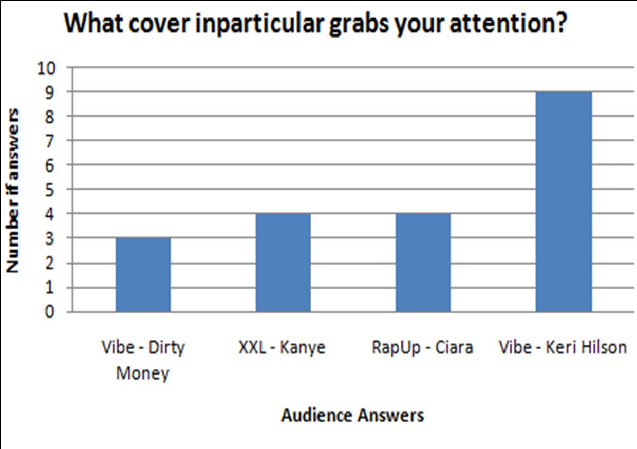
The graph above is about which front cover appeals most to the audience, and below I have provided the front covers that I used, and the majority decision with 9 votes is the Vibe magazine with Keri Hilson on as the main image.


Contents Page

The graph above is concerning how many images there should be on the contents page. The majority decision with 10 votes was 1 image.
 Therefore I will use 1 image on the contents page as that's what the audience are asking for.
The graph above is regarding the colour scheme between the title and background colour, and it asks whether the title should contrast or compliment the background. A majority of votes from the questionnaire was in favour of a contrast title, with 13 votes.

The graph above asks the audience whether I should continue the colour scheme from the front cover. A massive 19 out of the 20 votes were in favour of yes so therefore the answer from this graph is very clear.

The graph above concerns writing overlapping the images on the contents. The audience say yes or no, whether I should place writing on top of any images, and the graph is very conclusive, with a major 17 out of 20 votes saying no.

This graph above provides analysis for how many columns there should be allowed on the contents page for displaying articles and stories inside the magazine. The answers available are 1 column, 2 columns and 3 columns, and out of 20 votes, 2 columns was the most voted, with 14 votes and it is clear I should use two columns on my contents page.

The graph above is asking the audience about whether or not there should be an image on the contents page. Out of 20 votes, there were 19 votes in favour of Yes, so therefore I now know that the audience want an image on the contents page.

The graph above asks the audience whether I should use an image of the artist used on the front cover, and out of 20, 12 people said Yes, this is enough to say that most people want a picture of the same artist, but it isn't totally a unanimous result.

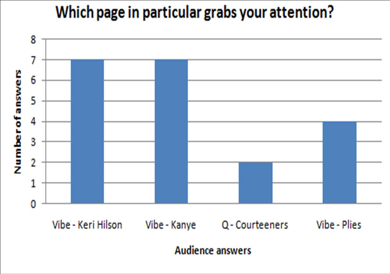
The graph above is asking the audience which contents page they preferred, and these contents pages have been provided below. And from the graph, there isn't a clear result. it is fairly spread and the top vote is 7 votes, which is both "Vibe - Keri Hilson" and "Vibe - Kanye". This is a bit complicated but it means I must pay attention to the design of Vibe magazine and that I can use either a male or female artist on my front cover with them both being equally liked.


Double Page Spread


The graph above is regarding how many images should be on the double page spread. The options available are 1 image, 2 images, 3 images and 4 images. The majority of votes picked 2 images, which got 12 votes out of a possible 20. Therefore, I will use two images on my double page spread.

The graph above is concerning the title overlapping any images on the page. The audience will reply saying "Yes" or "No". Out of a possible 20 votes, "No" got 12 votes so therefore it has received a majority of the votes, and I won't overlap the images with my title on my double page spread.

The graph above asks the audience where I should place my images, and it doesn't give clear answers. The most voted places were the "Centre of the page" and "Along the side". These answers were quite a way ahead of the other answers, so therefore I will place images in the centre and along the side of the page.
The graph above asks the audience whether the writing should overlap the images. And this graph isn't very conclusive, as No has 11 votes out of 20. Therefore it isn't a very large difference and perhaps I will have to make my own personal decision with this matter.

The graph above asks the audience whether or not I should continue the colour scheme from previous pages. The unanimous decision from the audience was to continue the colour scheme from both the front cover and contents, so to keep the colour scheme all the way through is what I will do with my magazine.

The graph above concerns what images I should use for the artist in the article. The audience mostly favoured using different and new images rather than the same images from the front cover and the contents page, so therefore I will use different images to suit what the audience want to see.

The graph above asks the audience which double page spread grabs their attention and the double page spreads I used are provided below. It was a balanced set of results. 3 of the 4 spreads were practically equally popular, which was "Lily Allen DPS", "Solange DPS" and "Black Eyed Peas DPS", and this means I will have to take tips from all 3 spreads on how to design my  double page spread.


Wednesday 16 February 2011

Questionnaire

Before starting to design my music magazine, I have had to consider the target audience, and how to make it appeal to the target audience. Therefore, since I only know of my interests in music, I will have to consider views of the target audience, which I've decided is ages 16-19, as I have people aged 16-19 around me in school, I can use them to help me with my research.
Therefore I will create a questionnaire to receive views of the target audience, and get them to give me their views on queries that I have raised. I have created 3 questionnaires, which are for each section; Front cover, contents page and double page spread. They will all be a closed type questionnaire, so basically it is putting a ring round your opinion to my question.
This is the first page of the questionnaire and it asks for the opinions of the audience on queries I have raised. It is focused pacifically on the front cover, and the questions are concerned with the arrangements and choices of the title style, the writing, the images, and the colour scheme. The layout of the actual questionnaire wasn't made to look stylish, it is made simply to be filled in and to retrieve information for me to take in and consider when designing my music magazine.

This is the second page of my questionnaire which concerns the contents page. Issues I have raised are to do with the layout, styles and sizes of the title, writing, images, etc. The aim of this is to obtain information from the right age group about the design of the contents page and how it will capture the attentions of the audience more effectively.

This is the third and final page of my questionnaire, and it concerns the double page spread. Questions asked are about sizes, styles and placement of titles, writing and images, as well as colour schemes.

Monday 14 February 2011

Music Magazine Double Page Spread Research

This is a double page spread from a music magazine. The artist on show is Solange Knowles, known as Solange and also as Beyonce's Sister. The crease in the middle of the page does not affect any of the writing on any of the page, or the main photo, so therefore the fold of the page has been considered and the writer of this page has organised how he was going to avoid any problems with the layout. This means the readers will be able to read all the writing easily without straightening out the page because the fold has made it a struggle to see what is written on the page. The effect upon the reader is that therefore the audience will be more likely to choose to read the article rather than skipping past it because the writing isn't clearly visible.
Another positive factor is the colour scheme, The uses of a lot of white, with grey and black writing helps compliment yet also contrast at the same time. It is difficult to believe these two completely opposite things can happen, but the grey writing helps compliment the black writing and black borders whilst contrasting the white background so it is clear to read. The black writing contrasts the background too. The way these colours compliment each other is despite being contrasting colours they also go well together, to contrast can also be to compliment sometimes, and I believe in this instance it is very much the case, and this gives the sense of the page being a picture taken from a negative effect camera, but the coloured large picture in the middle and the light blue writing also contrast the whole page, which is not "in the script", it is something the audience don't expect to see and this little touch of colour impresses the audience by making the colours stand out to the audience. They may stand out because the editor wishes the image to stand out in particular because of a certain importance that they represent, or just to add colour to the page so the overall view of the page isn't too bland or plain.


This is a double page spread from a music magazine. This particular article is about the Black Eyed Peas. Immediately the image will draw your attention since it takes up two thirds of the entire two pages, and a negative of the image crossing over the fold of the page is that the image is cut off and cannot be fully viewed by the audience, and this can put off the audience as they prefer to see full images rather than seeing half the image. An example would be going to see a film at the cinema, if you paid and only saw up until the last 20 minutes then had to leave you would be disappointed. Therefore I think the design of putting the image over the centrefold of the page was a poor decision.
The organisation of other features such as the column of writing is clear to see, as well as the writing isn't too large and doesn't take up a vast quantity so therefore allows for more written information to be put into the column, and the black coloured font is also a contrast of the white background and hence helps to stand out to the read, attracting their attention and they read the article, and also the simple type of font makes it even easier to read. The affect overall is that the audience will feel more compelled to read the article as there are less complications involved than there would be without the contrasting colours and simple font, and hence this will reel in the audience to read this article.
The colour scheme on the double page spread is clear to identify with a mix of gold, black and white with other similar colours like beige and light grey, which are located across the page in images, writing and headings and created images. The image of BEP (Black Eyed Peas) has all varieties of these colours, with Will.I.Am wearing an all gold outfit, which outlines him as a special character, sort of like the "Golden One" or "Special One", and he has also been brought forward and overlaps the other characters in the photo. Then the other characters who are more faded than Will.I.Am are wearing black, white, beige and grey which contrast and compliment each other at the same time. The colours certainly stand out as striking and different which will catch the eye of the audience, but these colours also look good together as they make the other colours stand out too, and hence further standing out. Also, the white background helps to make the characters stand out as they are wearing strong colours, and the overall effect is that they are the main feature on the page which will draw attention.


This is a double page spread for a music magazine. This article includes British singer Lily Allen. The centrefold of the page is always going to be a problem when creating a double page spread, and in this double page spread, they have had to put the title across the centrefold, as well as the image also crossing the centrefold, but it has been organised very well, and they have used a good solution in an attempt to counter the problem of the centrefold blocking a photo or written information. The main heading is a long title, and it has to be large to catch attention and where it has crossed the centrefold, there is not a letter directly on it, but around the centrefold the letters are a lot bigger than the normal letters so that it is easier for the audience to work out what the heading is in fact saying, and this is a very well used technique as I can quite clearly see what the heading says, and I can't imagine it being hard to realise what the heading says unless the reader of the article has severe eye problems. The image has also cross over the centrefold of the page, but what they have done is move the picture around and possibly alter the size so that the vital parts of the photo, like the face and body are clearly visible. The image is a mid shot so you can only see down to the waist of Lily Allen, and her arm crosses over the centrefold, which I wouldn't consider a vital part of the photo, and the effect this has is that it shows the audience what they want to see and this compromise is therefore a very good compromise by the designed of the double page spread.
The colour scheme on this article is a collection of red, white and black. The image of Lily Allen follows this scheme, as she is wearing a chequered red, black and white shirt, and her hair is also jet black, and this combined with a white background, and black writing, and a black heading background with white writing on is further evidence that their was a planned colour scheme in this double page spread. These colours help contrast each other in terms of the image standing out, the heading standing out and the writing standing out too, and this use of certain colours will look good together together and hence have the effect upon the audience to read this page.
This is a double page spread from a music magazine. This article in particular is about American Rock band My Chemical Romance. There is good organisation on how the centrefold has been dealt with in this article. The heading does cross over the centrefold it has been focused so that a letter doesn't directly cross over, and I think that it has been done well. This means that the audience won't have to straighten out the magazine as much as possible to read the full title, and this makes it easier for the audience to read and this will attract the audience to read the article. The typical audience is always looking for the articles which are easiest to read, as being able to do something easier is what everyone wants to be able to do, so therefore making the article easier to read is essential to reel in the audience. And the images and writing have been placed so they are around the centrefold of the page, hence making them clearly visible and readable for the audience, and the heading crosses the centrefold but a compromise has been taken into affect and it can be read.
There are 4 images altogether across the 2 pages, and all images are in a black and white colour effect, and they all look like in action shots which will be photos that will be in demand with the audience and therefore the black and white colour scheme makes the pictures "Classic", as the black and white pictures were in the olden days, 50+ years back and they are considered the classic days and therefore this effect will make the band seem more classic and thought of as a classic band, hence this will make the audience think they are great, and they will be attracted to the article because of the pictures and the effects.
Also, the colour scheme compliments the black and white picture effect as the background colour varies from mostly black and bits of red. This will look good amongst the black and white photos, and the effect upon the audience is that the page will attract them to read the information present on it. The white writing on the black background will contrast and stand out from the background and will encourage the audience to pay attention to it, and also black writing on a small section of white background has the same effect.

Monday 7 February 2011

Music Magazine Contents Page Analysis Research

This is the contents page for "Vibe" with a picture of Kanye West present on the page.
There is a clear colour scheme on this page, the uses of grey, black and white clearly combine with each colour helping one of the other colours contrast another. There has also been a black and white camera lens filter used on this to give the effect like pictures about 50 years ago when there weren't any colour photos around. However, there is one object on the page that has colour, and it is a red heart shape marked on Kanye's chest, and this emphasizes Kanye, and what the red heart represents, which will most certainly reel in the audience to be interested in why the red heart is there, why it is outlined, and why it regards Kanye, and will progress to read one through the magazine to find out. The colour scheme involved with the writing is simple and follows a pattern of the title being a large font, bold and black colour to stand out on a grey/beige background, hence catching the eye of the audience. Also, another trend I've noticed is that the more important writing is darker, and proof of this is that main titles are black, sub titles are grey and still a large font to continue to catch the eye, then the smallest writing has to be black to stand out to be able to read. Also, Kanye is covering the "V" on the page which shows the magazine don't need to represent their name on the contents page as their already a big name magazine and don't want to waste part of a photo to raise further awareness of the logo, therefore they prioritise the image to reel in more of the audience. Also, the layout is set out well, as the writing is simple in columns and gives a sense of a well organised page, which also makes it easier for the information on the page to be taken in.


 This is the contents page for "Vibe" with a picture of Ciara on the page
The image on this page is intelligently placed. According to the rule of thirds, Ciara isn't the most important thing on the page, however the way she poses, with her legs shaping to form a "V" in the air which just so happens to emulate the "V" at the top of the page, which represents the name of the magazine, which is something that can psychologically sway the reader to read on because of the way these features go together. Also the image has sexual appeal and will reel in the male audience in particular, as well as Ciara fans and general music fans. The colour scheme of Black, grey, beige and white is also supported with a background colour fade from black at the top to beige in the middle to white at the bottom. The colour of Ciara's clothes and hair link up with the background colours, and these colours compliment each other, hence impressing the reader in the process. The column on the right hand side of the page is rather wide for a column, but nonetheless a column which keeps the page organised and it is easier for the reader to take in the information being shown to them, however if I were to criticise this feature and suggest an improvement, it may be to alter this and put it into two slimmer columns. Elsewhere, the colour of the writing also compliments to background colour and image colour and hence the page goes together very well.

This is the contents page for "Vibe" with a picture of Plies on this page
The page has a colour scheme of red, white and black. The red background helps outline the white writing on the page as they contrast each other, and this catches the attentions of reader. Also, this helps the reader to read the written information with ease, rather than squinting to read it which would annoy the reader and would cause them to perhaps stop reading. The image overlaps the "V" which represents the name of the magazine, and it also overlaps the "Contents" title slightly, and this is a sign that the magazine is already well known and that the audience reading the magazine will recognise the "V" and the "Contents" and don't require to see them clearly and instead the image is promoted to catch the eye of fans of his music. The layout of the page is slightly confusing to me, as the title is actually level with the start of the column of the contents. The column is way up on the left and scrolls down the left, and is a good width but personally I think it is placed somewhere where it may confuse the audience and not fully catch their attention.


This is the contents page for "Q" with a picture of "The Courteeners" on this page
The colour scheme on this page is a mixture of white, red and black with various other colours present on images. The white background is always a good base to use lots of other colours on the page. The black writing in a simple font is a complete contrast of the white background and makes the writing stand out and clear to read. The effect this has upon the audience is that they won't have difficulties reading this so therefore they will not hesitate to read it. Also some text is surrounded by either a black or red area and the white writing with it stands out and the use of red as a more eccentric colour helps to further emphasize the importance of the writing within that area. The image of "The Courteeners" is of 4 men, and it is a long shot that shows all of the characters and also an establishing shot as you can see what landscape they are on, there are forests in the background and they are standing on a grassy hill. The pose they are doing is that they are a superior group of people, and this may be ironic as one character is wearing sunglasses when the whether is far from it as you can see grey clouds in the background, it looks more like there is going to be rain and thunderstorms than sunny whether, or it may be a way to make the group stand out on the page, to look unique! The effect upon the audience this has is that they will recognise the group and perhaps see why they are on the page, and what other articles are in the magazine.

Tuesday 1 February 2011

Music Magazine Cover Research

This is the XXL hip hop magazine. They have used a black background with other contrasting colours for the writing, such as a strong white and mild red colours, but they haven't used lots and lots of different colours to make the magazine look professional and not like any random person has created it. The picture used of Drake and Nicki Minaj who are currently in-demand hip hop artists and they are posed in a manor which will make the audience think they are "cool" and to be idolised. In the picture, they have also got no imperfections, which is probably the work of photo shop to make them look perfect and to have the full impact of reeling in the audience to buy the magazine. Also, I've noticed there is a slight low angle camera angle of this photo, which can emulate their current status in the hip hop world with them being in-demand and currently dominating sales and topping the music charts. Another factor is the main cover line is in a big font, it is bold and it stands out from everything, and will clearly catch the eye of the audience.
The image of the Nicki Minaj and Drake overlaps title, which shows magazine is already well known and not in your face as it doesn't require to be, hence it promotes the celebrities being shown on the cover more than the actual name of the magazine. Also, the celebrities are positioned directly in the middle of the magazine to further raise awareness of them, as the magazine is already known and doesn't require the name of the magazine to be further promoted, hence the magazine is using the celebrities as a prop to sell their magazine rather than relying on their own brand name.

This is the Rap up music magazine, which is a magazine which represents hip hop artists and rappers. This edition features hip hop female artist Ciara, also known for her work in R&B. The picture of her is positioned right in the middle of the cover which means it is the most important feature on the page according to the rule of thirds, and it is a large picture which is overlapping the title and has no writing overlapping the picture, further proving that this image is the most important thing in view. Therefore the effect upon the audience looking at the cover will be to focus of the picture, and the sexual appeal in this photo will more so appeal to men and this is stereotypically the type of audience who would go out and buy a music magazine, especially hip hop as it is a more hardcore magazine, compared to an eloquent type of music stereotypically associated with women, such as soft music like artists such as Taylor Swift and Michael Buble.
The pink background is a soft and feminine colour which will attract the attentions of women, as pink is a traditional colour associated with women and hence why they will use this colour to sell to the female audience.

This is the music magazine 'The Source' and on the cover is worldwide known hip hop artist and rapper Lil' Wayne. Since this magazine isn't a very well known magazine they have had to use a well known face to promote the magazine, and something I've known which proves that the magazine isn't a very well known magazine is that the masthead overlaps the picture of Lil' Wayne, however it has been adapted well as the use of a white masthead of a red background of Lil' Wayne's hat, and the masthead therefore stands out and will promote the magazine logo and name more effectively, and raising awareness of the magazine is also vital so that they can attract big stars for interviews and the main focus, the sell more magazines. There is a good colour scheme focus with reds being used in the picture of Lil' Wayne, and also on the area surrounding cover lines, and it helps to further outline the cover lines and masthead as the writing is white and black which clearly stands out and hence will attract the attentions of the audience. The image of Lil' Wayne is a close up, and he is directly in the centre of the front cover, so in terms of the rule of thirds he is the most important thing on the cover as well as there is a shallow depth of field and therefore further evidencing that the image is a key point on the cover. The main cover line is also about Lil' Wayne, so the image encourages the reader to read the cover line regarding him and to further read on to the article about him. Also, the use of famous names of music artists further promotes the magazine. The sell line on this cover is "The bible of hip-hop music, culture & politics" is well used in this instance, as it is placed just below the title so therefore it will probably be noticed by the audience, also the black background surrounding the white bold writing also creates the effect where the sell line stands out from the background and catch the eye of the reader.

This is the front cover of the music magazine "Vibe" with Keri Hilson on the cover. The colour scheme is a mix of various shades of blue, and red and white. The soft blue background helps outline her dark blue outfit to the audience, and the outfit itself has sexual appeal and will draw in men in particular and Keri Hilson fans. According to the rule of thirds, Keri is placed directly in the middle of cover which further emphasizes her image, as well as the image itself, I believe it has been more defined and catches all the attention immediately. The colour scheme for the writing is in reds and white colours, which the red is a colour of a vibrant colour which further catches the readers eye and it contrasts the blue background, as does the white writing as it is a complete contrast of blue, inparticular the dark and mild blues on this cover. The image also covers the "Vibe" masthead which shows the magazine is already an established magazine and doesn't require to sell the logo and brand name any further, as people already recognise it at a glance. Therefore, they use the factor of using the famous celebrity to promote the magazine and use the masthead as a back up.


This is the front cover for the music magazine "XXL" with Kanye West on the cover as the main image.
The white background helps a dark black image stand out, and also there is a black and white filter that has been used to take the photo which creates an element of importance and definitely a characteristic of "old school", which could be saying Kanye is a classic rapper and music artist. The contrast in colour catches the eye, but also the whole magazine cover is just about the picture, there is one cover line which is about Kanye, and this shows the importance of Kanye, and the one cover line, large centred image and nothing else being on the cover, and on the cover it also says it is a "special collector's issue", which indicates it is a vitally important magazine and the article about the artist is very important. Therefore, this special edition, combined with the large image and one main cover lines, means that this cover will excite the audience who see the cover and encourage them to purchase the magazine. The colour scheme is of black, white and red, which is almost like a negative colour camera lens, which makes the whole cover look like it is in black and white lens and then the red stands out as the one spectrum colour and helps to outline the masthead as important, and promotes the magazine name to the audience.