Friday, 25 March 2011

Front Cover Production

This was my stages of production for my front cover. There are five stages all together.

This is the first stage of production for my front cover. The background is a dim and light green colour because I don't want a white background. A white background is boring and will bore the audience. Therefore I have chosen to change the colour of the background to a colour that isn't too powerful so that it won't overpower the other features on the page. This is an advantage because the other features will easily stand out on the background.
I have use a dark green colour for my masthead. I have also used a seriff font, and I have made the title big so that it will easily catch the attentions of the audience. The style of the font makes it obvious that this cover has been created in Microsoft Publisher, and this is not a professional look for a magazine cover, and therefore I will look to change this.
Also, The bar code overlaps the masthead and this may be because the masthead is too big or because the bar code is placed in an awkward place that means I may have to either compromise the size of my masthead or move the bar code, or perhaps overlap the bar code with the masthead.
Also, the cover lines have been put onto this first draft. I have used a colour scheme that the first line of one of my cover lines is red and the other lines are green. This creates a system that the audience will understand clearly and will indicate which news stories are separate from one another. Therefore an advantage of this is that the audience will have the front cover made simple for them and they will have to put less effort into read the cover and therefore this will please the audience. However, it still isn't a style of colour scheme you would see on the front of a front cover, you would normally see an alternation of colours and therefore I need to improve this by perhaps alternating each line between the colours of red and green.

This is the second stage of production of my front cover. I have altered the masthead, by changing the font style and it also now overlaps the bar code. This font style looks a lot better than the previous style, you are more likely to see this font on a front cover than the previous style. This is a positive as I feel more confident that my front cover looks professional now. However, I still feel that this font isn't the font I want and may change it in a few stages time when I put my image onto my cover. Also with the masthead overlapping the bar code, it just doesn't look right. It looks like a clumsy mistake and therefore I will have to alter that too and make an improvement to the masthead.
The cover line colour scheme has been improved too. The alternation between red and green makes the magazine look much better than before. The change of colours every line is a professional look and makes my front cover look more like a magazine you would buy. The positive of this is the customer looking at this will obviously take more interest and be attracted to the colour scheme. However there is one issue with the colour scheme and that is I have tried to keep the start of each cover line as the colour of red and this has meant that in one instance the order of the colours going down the page is; (red, green, red, red, green). This one minor hitch is enough of a fault to annoy me and I think that it makes the front cover look pathetic that therefore I definitely want to rectify this problem. I will have to scrap keeping the start of each cover line the colour of red.
On the next stage I will look to insert the image, so that I can see how adding a large image to the page will create problems for other parts of the page and how I will find solutions to these problems.

This is my third stage of production for my front cover. I have used a green background so that the background isn't a boring white colour and I would prefer to fill the background as a different colour to make my front cover unique. I have done this in order for the audience not to be scared off by a boring background colour and to give the audience the impression I have used creativity to make a cover which won't bore the reader.
 My title font is large to capture the attention of the reader and inform them of the magazine they are looking at in order to raise awareness of the name. A negative of my title is that it is placed over the top of the image which ruins the image. The image is the greatest asset in catching the eye of the reader. So therefore the title spoils the image. Also the font style of the title doesn't look professional. You can tell that this has been designed in a simple publishing programme and the dark green doesn't stand out on a light green background as much as I wanted. So therefore this isn't a good look for attracting the audience and therefore improvements to the title include placing the image on top of the title and changing the title font style and also the colour of the title to a bold and strong colour which will stand out on a light background.
The cover lines are green and red and vary as each line of a cover line starts going down the page. The red is a bold colour which stands out on the light green colour, but the dark green doesn't particularly grab the attention of someone looking at this magazine. Perhaps the use of another bold colour that will stand out on a light coloured surface. The cover line on the image will require a light coloured cover line because of the dark blue t-shirt that the model in the image is wearing. Therefore, I will need to use a light and bright colour, perhaps white so that it clearly contrasts the dark blue colour and will stand out and be noticed by the reader.
I have inserted my image onto this draft to show how the cover lines fit in comparison to having an image on the page to consider shaping the cover lines around. This will help shape my cover a bit better.

This is the fourth stage of production for my front cover. First of all I have tried a method of making the cover lines stand out by using more colours to make it stand out. I have used the red and dark green from the previous draft and added white and black in there too. The white stands out well and works well with the dark blue colour on the image and I am happy with this improvement. However, the use of the dark green still does not work and the addition of black makes the magazine look scruffy and unorganised. The improvement I will next do will be to remove the dark green colour and replace it will a black font to see what this looks like.
The title has been improved, as the title is behind the image now, the font style and colour changed too. The font style is much more sensible and looks like a font you would see on the front of an actual cover. Also, the image is now not sabotaged and just because the image is on top of the title does not mean you can't tell what the title of the magazine is, because the title is barely even covered by the image, it only blocks a small part of a couple of characters in the title. Also the black is a great contrast from the background and catches the attentions of the reader with much more success.
I may also make the image bigger because it isn't big enough to be the main feature on the page, and although it will take up more of the page and cover more of the title, making the image bigger will catch the attentions of the reader with more success.

This is stage five of my production of the front cover. This is my final product. I have made a drastic change to the colour scheme by changing all green lines to black. I think the black lines stand out much better against the green background than the dark green cover lines. Also, the black cover lines are complimented by the dark clothing being worn by my model and the masthead and sell line are also black and compliment each other too. The only slight glitch of the colour scheme is that I couldn't use black cover line of the dark blue t shirt of my model and had to keep a white cover line and couldn't relocate the cover line to another point on the page. Therefore, The white may look out of place but it stands out and catches the attentions of the audience which is the whole reason I made the cover line white in the first instance. The black completely contrasts the light green background and the strong red is also contrasting of the background so therefore the cover lines will grab the attention of the audience.
The masthead is a large feature which doesn't overlap the bar code like in previous stages and the style of the font has a professional look to it, and also the way I have overlapped the image over the title slightly can suggest that my magazines brand name is already widely recognised and does not need to further promote the brand name and can use the image to promote the sales of the magazine.


Double Page Spread Photo Shoot

This is my photo shoot for my DPS (Double Page Spread), and I have took 3 long shots and 3 close up shots.
This was the first long shot image I took. I took it as a portrait photo to capture a long shot full body image. This allows an image which doesn't end suddenly at my models waist or half way down his legs. It means when I use this image I won't have to compensate for his body being cut off at some point. The pose that my model is showing with his arms folded and his hood up is a powerful pose. The image will make the audience feel inferior to this superior character. The audience will often idolise celebrities and music artists and this sort of image will be perfect to represent the character as a superior artist who needs to be idolised. A negative of the full body shot is that the floor will be included in the shot, and in this case the floor is a different colour to the wall which can be seen as a positive because it helps shape the picture with better emphasis and even though his lower body won't stand out as much, his lower body isn't vitally important. A negative could be that the trainers that my model is wearing don't stand out on the dark patch at the bottom of the image. If I could improve this photo, it would be to get my model to wear some bright trainers to catch the eye of the audience and appeal as a more attractive image. Therefore I think this image is an image that I would choose to use on my DPS.
I like this image and will use and edit the image because the pose is stylish and contemporary with the current audiences. Therefore I will use this image and use it as a large image to show the whole body of the model in order to attract the audience.

This was the second long shot image and I took it as a landscape image. It is also an in-action picture so it shows my model was doing something whilst he was having his image taken. One positive of the image is that there isn't a dark grey boring background at the bottom section of the screen. This means that the attention will be drawn to the model only and not a part of the screen with a dull and random colour. Negatives are that because I have used a taken the photo from a landscape orientation, I have cut off my models image from the middle of the legs, which means I am limited to where I can place my image because I can't show a full body image on the page. Another negative is the in-action shot means I couldn't see the face of my model and cannot clearly identify him and therefore this means that the audience might lose interest. The two negatives cancel out the one positive from this image, so therefore I wouldn't use this image in my DPS.
This is an in-action shot from distance and immediately I realise that the in-action shot doesn't show the face of the model, and therefore this may repel the audience because they want to see the face of the celebrity and therefore I won't use this image for editing because it won't serve a high quality service as an image.

This was my third and final long shot image that I took of my model. The pose is a laid back pose and will invite the audience in to read any information presented around the image. In this image, it was taken as a landscape photo and this has taken the dull grey colour out of the image but also cuts the image short halfway down his legs. This is bad because even though I have eliminated the dull grey from a previous photo, I have also cut the model off my image and will limited me to what I can do with the image.
This image is a more relaxed long distance image. The pose is chilled and also directly looking at the camera, hence addressing the audience and inviting them into the article. I would use this image but I believe my first long shot image is a better image and will probably prefer to use that instead.


The next three images are close ups taken in a landscape orientation.
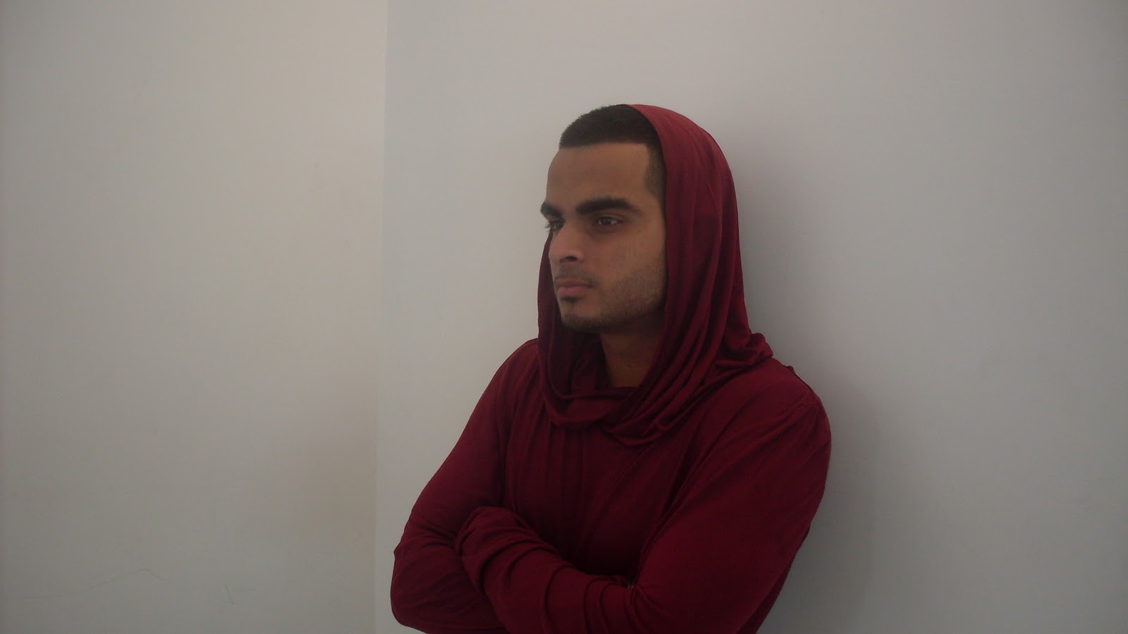
This is the first image I took. My Model has his hood up and the white background helps him stand out and will catch the eye of the audience. He is also staring past the camera which can add mystery into the minds of the audience, they will think; "What is he looking at" and be interested and read on to see if the article provides the information. The strength of his dark coloured clothes stands out from the background colour and will catch the eye of the audience.
This image is a close up image and the model stares past the camera, creating a atmosphere of mystery and suspense because the audience will be intrigued what he is looking at. So therefore I will use this image to edit and use on my double page spread.

This is the second image that I took. My model has this time looked past the camera much like the other image, but instead is looking the other way to see whether looking to the other side looks better than image number 1. Once again the use of dark clothes against a white background helps him to stand out from the background. The result of this will be he will catch the eye of the audience.
This image is similar to the previous image and therefore I will consider using it to be edited and put on my double page spread as it installs the same elements of mystery and suspense because he starts past the camera.


In this image, I have asked my model to look at the camera to vary the pose on the image compared to the previous images. With him looking directly at the camera, the audience will feel directly addressed by him in the article and can add a personal feel to the image.
This image is an image which the model looks directly at the camera and directly addresses the audience, and combined with the laid back pose, this may attract the audience to the article and therefore I may also use this image but it is likely I will use the other images for a different type of element, and add to mystery to the mind of the audience.

Contents Page Photo Shoot

This is the photo shoot for my contents page. I took two images, portrait and landscape images.
This is my first image that I took without a flash and I took it as a landscape image. I asked my model to dress with a hoody and to put the hood up and tighten it to his head. Then just pose like her was standing in any random place looking at the camera as something he might be looking at. The grey hoody helps outline his blue t shirt, his dark blue jeans and also his face which is a good effect to have. The only problem I have is the hoody might be too big because the hood is baggy towards the base of the hood and shoulder area. I took another photo, this time with as flash.
I don't think I would use this image because the image is limited and cuts at the models waist and I think I should at least include the top of his legs so that I have more options for placing my image on the page.
This photo was taken as a portrait photo and and with a flash. The improvements are that the model stands out from the background more, and I can also see more of his body in the shot. This therefore means he can take up more of the page when I edit and put him on my contents page. The facial expression is plain and this is was I wanted so that the audience have to read the writing about him to understand his emotion. Once again the grey hoody helps to outline his face, and helps his jeans and t shirt stand out and this means that this will catch the eye of the audience.
I would choose to use this image because it shows more of the model and also the slight tilt of the camera makes the pose slightly mysterious and will draw in the audience, therefore I will use and edit this image for my contents page.

Front Cover Photo shoot

I took 3 photos in total for my front cover. I asked my model to give different types of poses, like smiling, one not smiling and another pose which was different from the other two.

This photo is an original and unedited image which I didn't use the camera flash. This was the first image that I took. I liked the way he has put his arms to his side as it looks like a pose you might see in a typical magazine, but he has smiled and I don't think that's what you see on the cover of a magazine. I would prefer a plain facial expression as it is was I personally think is a typical magazine pose. The T-shirt he is wearing is good for a photo, the only problem is it eliminates contrast of a dark coloured text on the page, but could also help to compliment the colour scheme on the page.
I won't choose this photo because I do not like the pose and do not believe it would be seen on the front of a magazine as it doesn't look like a photo that would be professionally taken.
I zoomed out more for this photo and didn't use the flash on this photo. He has a plain facial expression which is more what I'm looking for, but he has a slight smirk which you don't see in images on a magazine, so therefore I feel that I needed to take another image. The dark T-shirt also lowers the effect of dark text, but could also compliment the text colour.
I won't choose this photo to be used on my cove because it is too casual with the arm across his body and it is a photo that wouldn't be on front of a music magazine.
This was my third and final photo, and for a different effect on this photo I used the camera flash. The result was that my model stood out much more in this photo and he had the perfect facial expression that I was looking for. The distance for the photo was also good, if there was one negative it would be the colour of the t shirt, but that can also have a positive because it can compliment the colour scheme, despite making dark coloured text stand out less.
I would use this photo because the flash has made the model stand out much more on the photo and the pose of the model is also a pose which is what you would see on the front cover of a music magazine, so therefore I will use this image.

Friday, 4 March 2011

Planning and designing of music magazine

The drawings below are my hand drawn designs for my music magazine, and the designs for the front cover, contents page and double page spread are included. These designs show how I thought up of potential designs and narrowed down to my final design by choosing designs and ideas to apply to the final design.


This is the first design for my front cover. As you can see, I have created 4 very basic designs just outlining where the image, masthead, sell line or cover line may go. The top left design was my first design, it has the title at the top and the sell line just below it to combine with the title. Then one image in the middle with cover lines placed around and below the image to make the image clear to be seen by the audience. And I have also placed the bar code in the bottom left corner out of the way of the rest of the magazine as it isn't what the audience want to look at, they are interested in the visual and written information on the page.
The top right design has the masthead at the top with the sell line just below. However the bar code is placed in the top right corner so the title isn't covering the top of the page, but a majority of the top of the page and aligned slightly to the left. This means the title isn't too stretched as it is only one word and I don't want it to be too wide for the purpose it was created to serve. Below this, there is one large image which takes up the entire section below and there are two cover lines placed around it so they don't overlap the image. There is one main cover line which is placed somewhere on the image, in the middle of the torso so that the audience will know it is about them.
The bottom left design has a sell line running across the top of the page, then has a masthead and a bar code running across the page just below it at the top of the page. Then in the lower section there is an image placed in the middle of the page which does run from the top to the bottom of the page and the cover lines are placed around it, and there are 4 cover lines, and one of them is a speech box to show they the story is about them and what they are saying, and this will intrigue the audience and think that there is an interview in the celebrity inside the magazine. This design gives the audience a chance to view visual and written information clearly, because the cover lines don't overlap the image and the image therefore can be clearly seen where as the written text can also be easily read.
The bottom right design has a masthead at the top and below the date and price with the sell line below that. The there is a large image taking up the whole section and there are 4 cover lines which overlap the image in places. This design prioritises the cover lines rather than the image to give the audience a chance to ingest written information rather than visual evidence.

 I preferred the bottom left and top right designs but decided to go for the bottom right design because it has 4 cover lines which the audience wanted in the questionnaire results. So therefore I will use 4 cover lines to meet the requirements of what the audience want. Also, The audience want one image on the cover and that design gives one image, therefore this cover should be a good hit with the audience, as well as being one of my favoured designs.


This is the second phase of designing the front cover. I have elected a design from the 4 initial drafted ideas. I chose the bottom left design. And on this I have drawn up a slightly bigger version, and thought of some potential mastheads, sell lines and cover lines. I have made many potential ideas so that I am not short of choice when it comes to choosing what features I want on the page.
Also on this design I have made it clear which features have priorities over other features. I have shaped cover lines around the image but on cover line will have to overlap the image, but it will only overlap part of the arm on the image which isn't a vital part of the image. The speech bubble shape of the cover line in the top right of the page is an innovative new idea from myself to show that the image on the front cover is saying this, and the effect upon the audience will be to know why they have said this. Therefore, this draws them into reading on further into the magazine to find the answer to this.
This is the final design of the phase of creating the front cover. I have added all details to the full A4 page design apart from the cover lines because I haven't decided which ones I will use yet. I have created cover lines on my designs but when I am creating the actual front cover, I will include the cover lines then because I will know how they will fit on the page, as I don't know how it will fit on the page currently.
I have placed the cover line boxes where I intend them to be and I have rotated them slightly to the right and this means the audience have to tilt their head slightly to read it, and if someone tilts their head, it normally means they are interested in what they are looking at and this effect I feel will psychologically interest the reader and persuade them to read on.
Also, The word in the masthead is Louder. The design has the "L" continue all the way under the bottom of the rest of the title. This is something to make the title stand out to the audience, to catch their attention to the magazine cover. Unique things catch peoples attentions, and this unique design is designed to do that, and bring the audience to be focused on the front cover of the magazine, and absorbing the information being presented on the front cover.
The overall impact is that the front cover is what the audience see first, and if the front cover isn't good enough, the audience can just dismiss the magazine and not look at the content within the magazine. This is disastrous for the magazine, so this is why the front cover is such a crucial factor on the magazine. A cover that is too plain will be boring and the audience won't want to read on and be bored by the content of the magazine. Too much writing on the front cover will have a similar effect, as the audience want a mixture of images and text on the cover, and too much writing will make the audiences eyes tired and bore them, hence they won't pay attention to the contents of the magazine, which creates the same factor of boredom as the previous example of a cover too plain. A cover fill with images and not any writing, will not give the audience any information of content within the magazine. Therefore, they won't know what the content of the magazine actually contains, and rather than wasting their time looking, they don't waste their time and turn their attentions elsewhere.


This is the first phase of designing for my contents page. I have created 4 designs. The top left design was the first design that I created. The title goes across the top of the page from left to right. This is done so that the audience will know the name of the magazine is on the contents, and so that they are still reading the right magazine. The image is a full page image on the left hand side of the page which taken up half the page width ways. Then on the right hand side there are two columns of stories available within the magazine. The audience were asking for two columns from the questionnaire results, so therefore I made a design met the wishes of the audience. There is a space just above the the columns which I won't put anything in, it will be empty space and I have done this so that the page won't be too compacted, so therefore it helps to stop the page being so congested.
The top right design is set with the sell line from the front cover running across the top of the page. Then below this is the title of the magazine and there is another space below, possibly to let the audience know its the contents page. Then below, you have an image in the middle of the page with a column either side of it. This allows the image to be a main focus to draw in the audience, and also it means that next to the image are the columns, which have written text in then, about stories available within the magazine. The image takes the attention, but with the columns of text next to the image, they will take notice of them too.
The bottom left design has the title running across the top of the page. Then one large column down the left hand side of the page. Then on the right hand side of the page is a large image. This is an experimental design as the audience were asking for two columns but I have decided to design something a bit different to see if it will look good.
The bottom right design has the title running three quarters of the way across the top of the page. Then there is an image which is from the top of the middle of the page. Then at the bottom there are 3 columns. This is another experimental design, using 3 columns instead of the 2 columns the audience asked for. The image being in the middle might capture the attention too much and the columns of text won't catch attention and the audience might not take in the information that is on the page.
I chose the top right design because the front cover I chose to use had the sell line running across the top and I want to use this feature throughout the magazine, and also, it has two columns,  the page less congested because the columns are placed either side of the image in the middle of the page.
This is the final phase of designing the contents page is an A4 on paper version. The sell line running across the top is there to give a sense of continuity throughout the magazine. This will constantly remind the audience of the magazine name and this can help the audience create a loyalty with the magazine brand. Then the title Contents page is just below the sell line and with the magazine title just before that. This helps remind the audience that they are on the contents page and also the magazine they are reading. Then the large image placed in the middle with the columns either side helps to make the page less congested, and doesn't clog all the page, and makes the page more organised and easier to navigate rather than having a page which has all the text clumped together and is unattractive to look at.


This is the first phase of my designing the double page spread. I have created 4 designs of potential double page spreads I could create. I have had to do this design land scape because of designing two pages, on a portrait page orientation would mean the design would be too squashed on the paper and therefore landscape means you can clearly see the design features.
The top left design has the title on top of the left page with a column of writing on the left side of the left page and an image filling the rest of the page. On the right page there is an image running across the top of the page and then 3 columns below it taking up the rest of the space on the iPod. This design shows large images and also a lot of writing to show both visual and written information. This design will mix the focus of the audience as there is information available on both pages so they will have to absorb written and visual information on both pages.
The top right design tries a different tactic to the previous design. On the left page is a full page image with no text or anything else on the page so the image is the only focus on the page. On the right page the title runs across the top of the page and the rest of the page consists of two columns of writing. This design has different types of information available on different pages. Visual information in the form of a picture on the left page and written information on the right page.
The bottom left design uses a title at the top of both pages, but not a title running across the top, the titles are both different titles. Then the the left page, the rest of the page consists of an image in the middle third of the page with 3 columns at the bottom of the page. This allows the image to be clearly seen with a title above it giving a headline to the story surrounding the person in the photo. Then the columns can give the story of what has happened with this celebrity in recent news.
The bottom right design uses another different style for displaying the title, which is having the title run across the top of both pages, which this means that the words will actually run across the fold in the middle of the double page spread. This could potentially cause a problem but doing this saves much more space for other features on the page so I will try to make the title clear by avoiding any placement of words too near the fold in the centre of the double page spread. The rest of the left hand page consists of a full page image. This helps show more of the celebrity, as well as showing greater detail. The right hand page has 3 large columns on, which will consist of the story regarding the image on the left page.
I have chosen the bottom left design because on the questionnaire research they asked for two images on the double page spread and this is my favoured design with two images because I feel the images are appropriately placed and have columns placed appropriately in order to have written information about news regarding the person in the photo. Also the titles are the top of the page are a good idea, however I might alter the design and use the title from the bottom right design as I like the idea of the title running across both pages and over the fold of the page because it will make the title apply to both pages and this is something I feel would be good for the magazine rather than having two titles about the same thing, it just saves time and I can also make the title bigger.

This is the final design of the double page spread, once again designed on a landscape orientation on A4 paper. The titles at the top are now aligned to show that the top border on both pages is just a continuous title. The images are the main focuses as they are large and taken up a majority of both pages with small sections of writing so that I will give enough information to satisfy the read but also not too much writing to put off the reader and bore them. There is still one feature which I haven't added to the design and this is because I am unsure whether to add it yet and I'm going to apply it when creating my double page spread to see if it is a good edition. This feature is the sell line which runs across the top of the page, which I used on the front cover and contents page. I wanted to have it on the very top of the page on every page but I'm unsure if it is necessary so therefore I haven't included it in my design as it isn't an essential feature, but if I feel it makes my double page spread look better whilst I am creating it, this feature will be added.


Basic Outlined Designs, Created on the Computer
Front Cover Page
The design above is the front cover design which I have created in publisher. It shows where I desire to put outlined features such as the sell line, the masthead and the cover lines and the image. The image is placed in the middle in order to draw attention to the magazine and by being placed in the middle in the place where it is highly visible to the audience. The cover lines will be placed around the image in order to inform the reader of information about the image and about other news happening in the world. The masthead is placed at the top because it helps to catch the attention of the reader, as well as giving a title to the page and also raising awareness of the magazine brand name at the same time. The sell line just above the title doesn't interfere with the layout of the page but also adds an element to the page and the magazine that will make the magazine on the whole seem a step better than the rest of the magazine producers, and that the information available within the magazine is exclusive and break taking news. The colour scheme that will be used on this page will try and compliment the background colour with the image but then the text will be designed to contrast and stand out so that the audience will see the text and pay attention to what the text says and the result of this is the reader acknowledges the information and this will urge them to read on further through my magazine. I will also use a san seriff font for my text because it will clear and easy to be read rather than a complicated font which will require the read to stress their eyesight to read the writing, and they won't bother doing this, and instead won't read the magazine and may choose not to buy the magazine next time.

Contents Page
The contents page layout is similar to the layout of the front cover page. This is because I am trying to apply an element of continuity throughout the magazine and using similar designs can help achieve this. I have also chosen to use the sell line across the top of the page to further the element of continuity, and this will help the magazine to feel more flowing when the user is reading through the magazine. The image will once again be placed in the middle of the page to catch the eye of the audience and the cover lines and stories will be in columns either side of the image in order to offer information to the reader when they look at the image. The page will be given a title of "Contents Page" or "Contents" to let the reader know what page they are actually reading so that they don't feel lost when flicking through the magazine. The colour scheme will be continued from the front cover, where there will be a complimenting scheme, but the text will be designed to contrast and catch the eye of the audience. The result of this will be that the audience will be attracted by the colour scheme and the contrast writing will stand out and they will notice this, and read and take in the information on the page. I also use a san seriff font on this page, similarly to the front cover. I want the reader to have no problems with the size and style of the font, and to make it easy and clear for them to read this information, and by doing this they will prefer to read my magazine which doesn't make them have to strain their eyesight in order to read the information.

Double Page Spread

The DPS (Double Page Spread) page is set out on two A4 pages. I have decided to put the title across the top of both pages, perhaps it will be a continuous title running across the fold between the pages or it could have an independent title on each page. Preferably the title would run continuously across the fold between the pages, but depending on the size of certain words and fonts, then I will have to see how the title fits into the position that I desire. I have already considered the problem with the fold in the middle of the page, and I cannot yet say how I will resolve this problem until I am actually creating the DPS. If I cannot put the title across the centre, I will have to either abandon a title or have two individual titles. The images on both pages are large so that they catch the attentions of the audience, and so that I don't overload the page with writing so that I don't bore the reader. By doing this I have sacrificed space for written information but too much text will repel the writing. I have used 3 small columns of text at the bottom of the left page. I have used 3 columns because if I had just one column the sentences would be dragging across the page and would make the page boring, whereas the sentences in columns are more short, sharp and to the point. They will give the readers eyes a break instead of them scrolling from one side of the page to another in order to read a sentence and it will bore the reader, make them tired and they won't pay full attention the written information.
On the right page, the large column of text is a little wider than the other columns, but not too wide. It allows a decent amount of content in the column and it isn't too wide to bore the reader. Overall over the two pages, there is enough space for a good amount of text to inform the reader and there are large images to capture the readers attention, and also to help relieve any boredom that the reader has acquired from reading the writing.

Monday, 28 February 2011

Graphical Evidence of Questionnaire Analysis

Displayed below are a number of graphs which have resulted from analysis of my questionnaire. There are 3 different sections concerned with the questionnaire; the front cover, the contents page and the double page spread.
These graphs represent the opinions of the general audience aged 16-19 within my area of how to create a music magazine that will meet its purpose with more success.
I handed out 20 questionnaires and received 20 questionnaires back so therefore the number of answers I receive back for each question should total up to 20.

The front cover 
The graph above is regarding the front cover. As you can see the title on the graph is a query I have raised, and the available answers are "Yes" and "No". The result from this graph is the majority of people chose "Yes", however it is a narrow result, as it is a difference of 2 votes, and therefore it is not a completely clear set of answers.

The graph above is to do with the "appropriate amount of cover lines on the front cover". The answers available have a wide range which is; "1,2,3,4,5,6 and 7+". Giving this sort of wide range helps me to seek more precise results from this graph as I can find out the exact specific features that the audience want on this magazine. There is a clear answer available from this graph, and the clear majority chose "4" as the optimum amount of cover lines on the front cover of the magazine.

The graph above is concerning the "Main image on the front cover". There are 5 answers available and there are 3 answers that the majority have picked the most and they are approximately the same level. The "Solo Female Artist" has got the most votes, but very narrowly to the "Solo Male Artist" and the "Male Group" options.

The graph above is regarding the "Writing Colour beneath the cover lines" on the front cover. The available answers for the audience are "Yes" and "No". The result was clear as 17 of the 20 questionnaires received said "Yes". This therefore gives me a clear indication to use a different colour for the writing underneath my cover lines. 

The graph above is regarding the "Title Font" and which style I should use for it. The available answers are; Seriff, San Seriff, Seriff + Bold and San Seriff + Bold. From a visual analysis of the graph, the font "San Seriff" seems to be the font being chosen most. The choice between using a bold font or not seems to be my decision as the audience answers are too close to clearly indicate a preference.

The graph above provides analysis of audience opinions on whether or not the title should overlap the main image on the front cover. The majority decision from the audience is yes, with 14 out of 20 people saying yes and therefore it is a clear indication.

The graph above is asking the audience what colour scheme they think will be best on a magazine. The majority vote by 3 votes to the nearest answer, with a total of 8 votes was Black, Red and White. Therefore, I will consider this type of colour scheme for my magazine

In the graph above, I have asked the audience what font they think would be best to use for cover lines, and the majority decision was Seriff + Bold which was 3 votes clear of the next closest answer.

The graph above provides analysis of the results regarding how many images should be used on the front cover. The majority decision with 14 out of 20 votes is to use 1 image on the front cover.

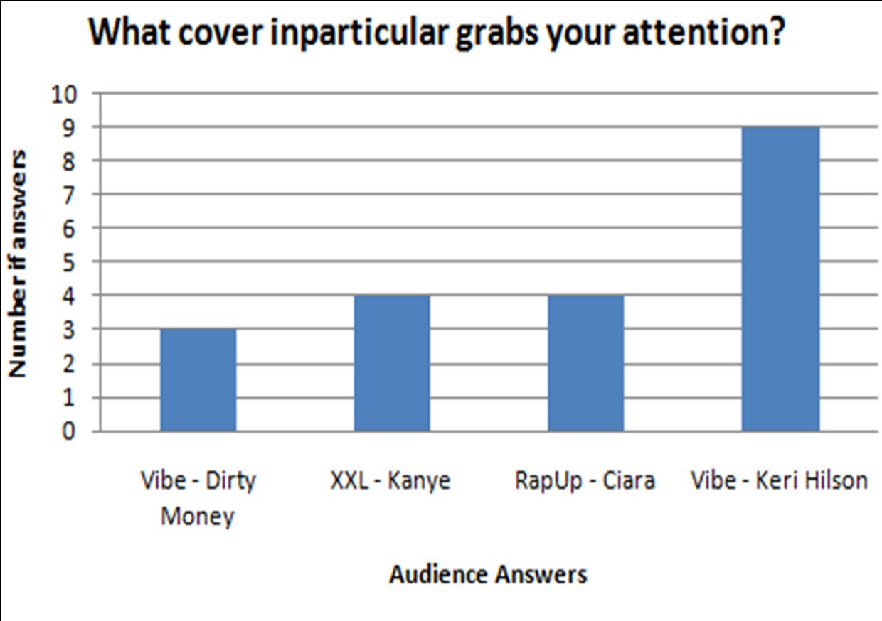
The graph above is about which front cover appeals most to the audience, and below I have provided the front covers that I used, and the majority decision with 9 votes is the Vibe magazine with Keri Hilson on as the main image.


Contents Page

The graph above is concerning how many images there should be on the contents page. The majority decision with 10 votes was 1 image.
 Therefore I will use 1 image on the contents page as that's what the audience are asking for.
The graph above is regarding the colour scheme between the title and background colour, and it asks whether the title should contrast or compliment the background. A majority of votes from the questionnaire was in favour of a contrast title, with 13 votes.

The graph above asks the audience whether I should continue the colour scheme from the front cover. A massive 19 out of the 20 votes were in favour of yes so therefore the answer from this graph is very clear.

The graph above concerns writing overlapping the images on the contents. The audience say yes or no, whether I should place writing on top of any images, and the graph is very conclusive, with a major 17 out of 20 votes saying no.

This graph above provides analysis for how many columns there should be allowed on the contents page for displaying articles and stories inside the magazine. The answers available are 1 column, 2 columns and 3 columns, and out of 20 votes, 2 columns was the most voted, with 14 votes and it is clear I should use two columns on my contents page.

The graph above is asking the audience about whether or not there should be an image on the contents page. Out of 20 votes, there were 19 votes in favour of Yes, so therefore I now know that the audience want an image on the contents page.

The graph above asks the audience whether I should use an image of the artist used on the front cover, and out of 20, 12 people said Yes, this is enough to say that most people want a picture of the same artist, but it isn't totally a unanimous result.

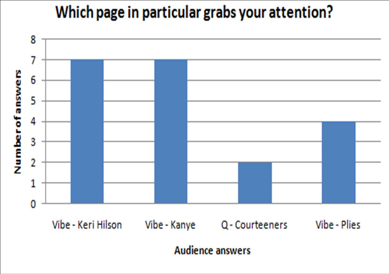
The graph above is asking the audience which contents page they preferred, and these contents pages have been provided below. And from the graph, there isn't a clear result. it is fairly spread and the top vote is 7 votes, which is both "Vibe - Keri Hilson" and "Vibe - Kanye". This is a bit complicated but it means I must pay attention to the design of Vibe magazine and that I can use either a male or female artist on my front cover with them both being equally liked.


Double Page Spread


The graph above is regarding how many images should be on the double page spread. The options available are 1 image, 2 images, 3 images and 4 images. The majority of votes picked 2 images, which got 12 votes out of a possible 20. Therefore, I will use two images on my double page spread.

The graph above is concerning the title overlapping any images on the page. The audience will reply saying "Yes" or "No". Out of a possible 20 votes, "No" got 12 votes so therefore it has received a majority of the votes, and I won't overlap the images with my title on my double page spread.

The graph above asks the audience where I should place my images, and it doesn't give clear answers. The most voted places were the "Centre of the page" and "Along the side". These answers were quite a way ahead of the other answers, so therefore I will place images in the centre and along the side of the page.
The graph above asks the audience whether the writing should overlap the images. And this graph isn't very conclusive, as No has 11 votes out of 20. Therefore it isn't a very large difference and perhaps I will have to make my own personal decision with this matter.

The graph above asks the audience whether or not I should continue the colour scheme from previous pages. The unanimous decision from the audience was to continue the colour scheme from both the front cover and contents, so to keep the colour scheme all the way through is what I will do with my magazine.

The graph above concerns what images I should use for the artist in the article. The audience mostly favoured using different and new images rather than the same images from the front cover and the contents page, so therefore I will use different images to suit what the audience want to see.

The graph above asks the audience which double page spread grabs their attention and the double page spreads I used are provided below. It was a balanced set of results. 3 of the 4 spreads were practically equally popular, which was "Lily Allen DPS", "Solange DPS" and "Black Eyed Peas DPS", and this means I will have to take tips from all 3 spreads on how to design my  double page spread.