This is my photo shoot for my DPS (Double Page Spread), and I have took 3 long shots and 3 close up shots.

This was the first long shot image I took. I took it as a portrait photo to capture a long shot full body image. This allows an image which doesn't end suddenly at my models waist or half way down his legs. It means when I use this image I won't have to compensate for his body being cut off at some point. The pose that my model is showing with his arms folded and his hood up is a powerful pose. The image will make the audience feel inferior to this superior character. The audience will often idolise celebrities and music artists and this sort of image will be perfect to represent the character as a superior artist who needs to be idolised. A negative of the full body shot is that the floor will be included in the shot, and in this case the floor is a different colour to the wall which can be seen as a positive because it helps shape the picture with better emphasis and even though his lower body won't stand out as much, his lower body isn't vitally important. A negative could be that the trainers that my model is wearing don't stand out on the dark patch at the bottom of the image. If I could improve this photo, it would be to get my model to wear some bright trainers to catch the eye of the audience and appeal as a more attractive image. Therefore I think this image is an image that I would choose to use on my DPS.
I like this image and will use and edit the image because the pose is stylish and contemporary with the current audiences. Therefore I will use this image and use it as a large image to show the whole body of the model in order to attract the audience.

This was the second long shot image and I took it as a landscape image. It is also an in-action picture so it shows my model was doing something whilst he was having his image taken. One positive of the image is that there isn't a dark grey boring background at the bottom section of the screen. This means that the attention will be drawn to the model only and not a part of the screen with a dull and random colour. Negatives are that because I have used a taken the photo from a landscape orientation, I have cut off my models image from the middle of the legs, which means I am limited to where I can place my image because I can't show a full body image on the page. Another negative is the in-action shot means I couldn't see the face of my model and cannot clearly identify him and therefore this means that the audience might lose interest. The two negatives cancel out the one positive from this image, so therefore I wouldn't use this image in my DPS.
This is an in-action shot from distance and immediately I realise that the in-action shot doesn't show the face of the model, and therefore this may repel the audience because they want to see the face of the celebrity and therefore I won't use this image for editing because it won't serve a high quality service as an image.

This was my third and final long shot image that I took of my model. The pose is a laid back pose and will invite the audience in to read any information presented around the image. In this image, it was taken as a landscape photo and this has taken the dull grey colour out of the image but also cuts the image short halfway down his legs. This is bad because even though I have eliminated the dull grey from a previous photo, I have also cut the model off my image and will limited me to what I can do with the image.
This image is a more relaxed long distance image. The pose is chilled and also directly looking at the camera, hence addressing the audience and inviting them into the article. I would use this image but I believe my first long shot image is a better image and will probably prefer to use that instead.
The next three images are close ups taken in a landscape orientation.

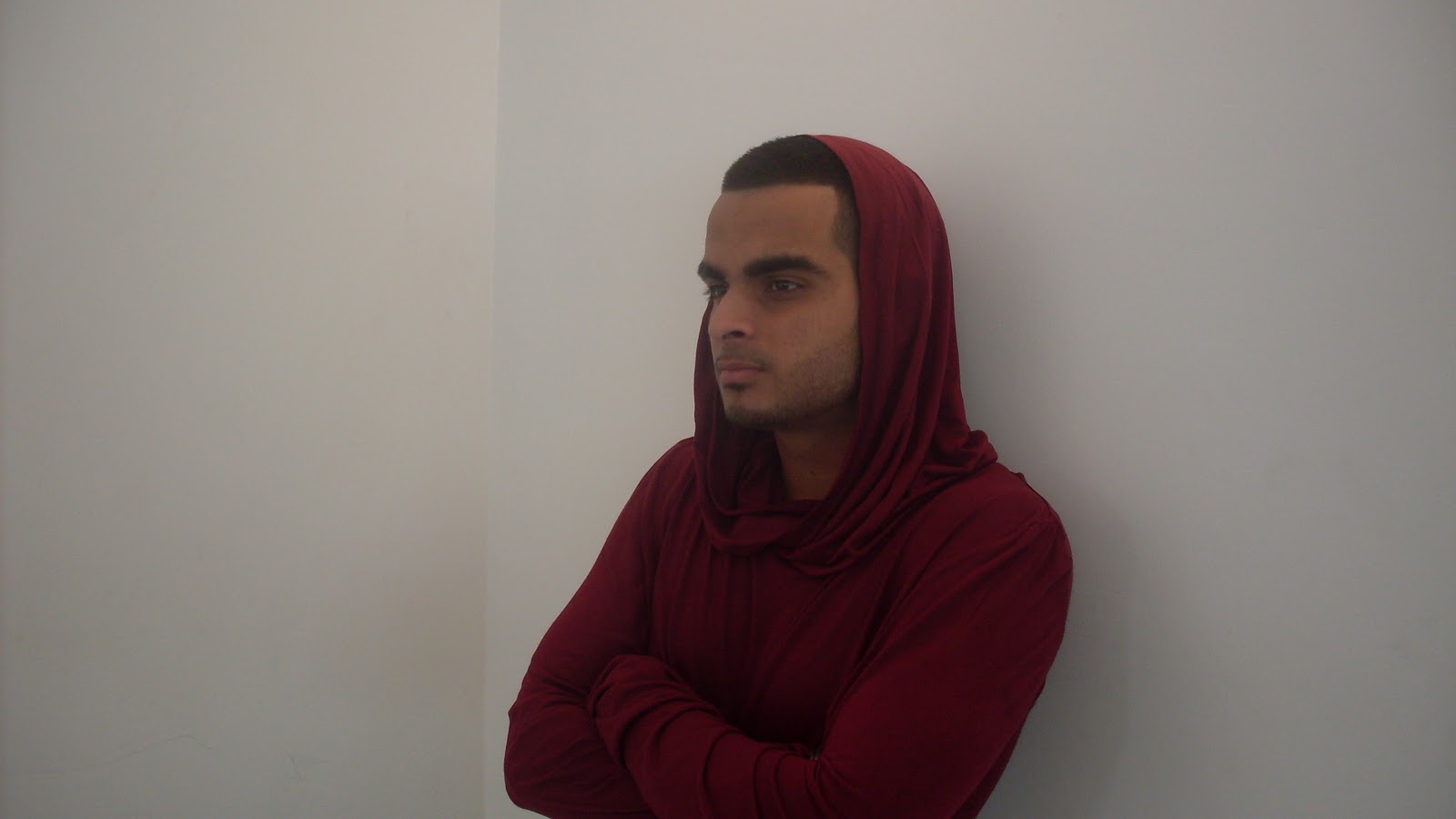
This is the first image I took. My Model has his hood up and the white background helps him stand out and will catch the eye of the audience. He is also staring past the camera which can add mystery into the minds of the audience, they will think; "What is he looking at" and be interested and read on to see if the article provides the information. The strength of his dark coloured clothes stands out from the background colour and will catch the eye of the audience.
This image is a close up image and the model stares past the camera, creating a atmosphere of mystery and suspense because the audience will be intrigued what he is looking at. So therefore I will use this image to edit and use on my double page spread.
This is the second image that I took. My model has this time looked past the camera much like the other image, but instead is looking the other way to see whether looking to the other side looks better than image number 1. Once again the use of dark clothes against a white background helps him to stand out from the background. The result of this will be he will catch the eye of the audience.
This image is similar to the previous image and therefore I will consider using it to be edited and put on my double page spread as it installs the same elements of mystery and suspense because he starts past the camera.

In this image, I have asked my model to look at the camera to vary the pose on the image compared to the previous images. With him looking directly at the camera, the audience will feel directly addressed by him in the article and can add a personal feel to the image.
This image is an image which the model looks directly at the camera and directly addresses the audience, and combined with the laid back pose, this may attract the audience to the article and therefore I may also use this image but it is likely I will use the other images for a different type of element, and add to mystery to the mind of the audience.
No comments:
Post a Comment